The sword model will have a lot of scratches on the blade section, which will be improved a lot with the use of a normal map to bring out the depth of the scratches. I really like how much detail normal maps can bring into models just by adding small bits of depth in certain places, and I really want a lot of detail for the sword model because it would be used by the player and seen a lot. I have provided an image of a deep scratch in metal, and if you look at it closely you can see how the light bounces off each part of the scratch, it has a sort of lighter outline where the metal bumps out, then the really deep part which has a shadow. This image also illustrates different states of scratches because it goes from deep to shallow.
My model will also have a lot of other parts on the normal map that will need to be either raised or lowered. If I add any buckles or anything to the handle for example, they would need to be raised out so they look as if they are actually on the model, rather than just being flat against it.
The specularity for a sword changes for what part of the sword it is on. For example the blade would be quite shiny, but the hilt would be rather dull in comparison. I will need to pay attention to what parts need to be shiny and which don't on my specularity map for it. Below I have posted pictures of leather and metal to compare how shiny they are.
Friday, 2 July 2010
Ship texture ideas
The ship will be made out of painted metal, which is going to be worn in specific areas. I do not want the ship to look super shiny, so I want to have the specularity map reflect this feature. I can do this by only using dark colours on the specularity map so that it isn't too shiny, also I will use grey colours because at the scale the ship is at, you probably wouldn't be able to see much colour shining off of the ship. Again I have chosen a boat to stand in for the fictional creation of a space ship, so I have posted a picture below to show how shiny I want it to be, as well as showing a similar colour scheme.
Thinking of some ideas for what kind of bumps would be on a space ship, I had an idea that it might have some kind of dimples over the hull of the ship to help it's aerodynamics in atmospheres, just like a golf ball. I have shown a close up of a golf balls dimples below so that I can try and explain my idea. The normal map should have circles on that get darker in the centre so that it looks like a rounded dimple, rather than the holes just coming out of nowhere.
These dimples look a little bit close together for how I want my ship to look, I will space them farther apart on the normal map.
Crate texture ideas
As explained in a previous post, my crate will be made from wood and it will be slightly worn. Because of this I will have to use different kinds of textures and maps to match how the object looks in real life.
Wood usually has a specific grain which, unless sanded and varnished, produce a bumpy texture. I can replicate this feature by using what is known as a normal map. Normal maps are 2D images that define a 3D depth in the pixel colours, which means normal maps often look similar for different models. For my model I want the bumps to follow the grain of the wood, so I can adapt my coloured base texture and make it into a normal map so the grain has accurate bumps. As you can see in the image below, wood can sometimes have quite deep bumps and gaps in which could easily be replicated with a normal map.
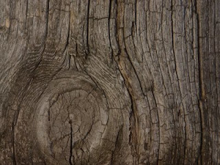
All of the raised parts of the wood grain would also reflect light in a different way than the grooves of the grain. This kind of effect would be achieved with a specularity map. Specularity basically defines how shiny textures are, and what colour they might reflect. On a specularity map, darker colours will make the texture less shiny, and lighter colours more shiny, and the hue of the colour will define what colour gets reflected from that part of the texture. Depending on how wood is treated, it can be very shiny or very dull, and my crate will be made of wood that is very dull, although all objects reflect light at least a small bit. I have provided an image below to show how shiny wood can get.
Subscribe to:
Posts (Atom)